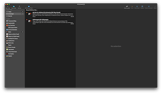
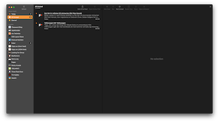
This morning, my app of choice for reading RSS feeds; NetNewsWire, notified me of an update. This was a major version update which included a new app icon and an updated UI for Big Sur. This gave me the opportunity to grab a screenshot to compare. So I did.


It’s a bit pointless, but also interesting to compare how Big Sur affects the design of apps on the Mac. I’m also thankful I get to keep the text below the icons in the toolbar.