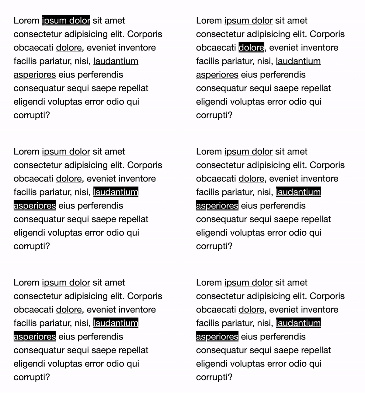
Some time ago, I worked on a project where we made digital teaching aids. It was essentially web based e-books. Most of these materials would contain links leading to other parts, and in some instances the text could be inside colored boxes, for example an info box or something along those lines. Did I mention that links could also be inside those colored boxes?
Since this was teaching materials for public schools, we had accessibility requirements to fulfill. This included clear and distinct focus states for users navigating the UI with a keyboard. We chose to invert the colors of links — that is, if the text color was black and the background was white, upon focusing a link the background would turn black and the text white.

It’s a fairly simple setup. The required styling would be accordingly:
body {
  background-color: #fff;
  color: #000;
}

a {
  color: currentColor;
}

a:focus {
  background-color: #000;
  color: #fff;
}
Thus far, things aren’t too complex. We also chose to let links have the same color as the text and to rely on their underline to indicate that it was a link.
Now, about those colored boxes. One scenario could be the following:
.theme-1 {
  background-color: antiquewhite;
  color: darkred;
}
If we wanted the same effect as above, we would need additional styling for the links:
.theme-1 a:focus {
  background-color: darkred;
  color: antiquewhite;
}
This would need to be repeated for each theme, which in itself could be a bit tedious.
CSS custom properties to the rescue
What if you could have just one set of rules for this focus styling, no matter how many themes you create? Well, thanks to the power of variables in CSS — or as they are actually called: CSS custom properties — we now can.
Consider the following:
:root {
  --background: white;
  --text: black;
}

body {
  background-color: var(--background);
  color: var(--text);
}
This is our starting point. The neat thing about custom properties is that, like other properties in CSS, they are a part of the cascade. This means that they can either be global, as in the above example where we’ve declared two properties in the :root selector, or they can be scoped to a selector. Now, let’s style our links.
a {
  color: currentColor;
}

a:focus {
  background-color: var(--text);
  color: var(--background);
}
As stated before, we first make sure that links use the same color as the text, then we start leveraging the power of custom properties. This is the inverting of the colors in action. We’re actually done with the styling of the links. Don’t believe me? Check this out. We’re going to make ourselves a nice colored box. First the markup.
<div class="themed-box box-theme-1">
  Content here
</div>
Then, we do the styling.
/* Set up our themed boxes */
.themed-box {
  background-color: var(--background);
  color: var(--text);
}

/* A pretty, colored box */
.box-theme-1 {
  --text: white;
  --background: green;
}
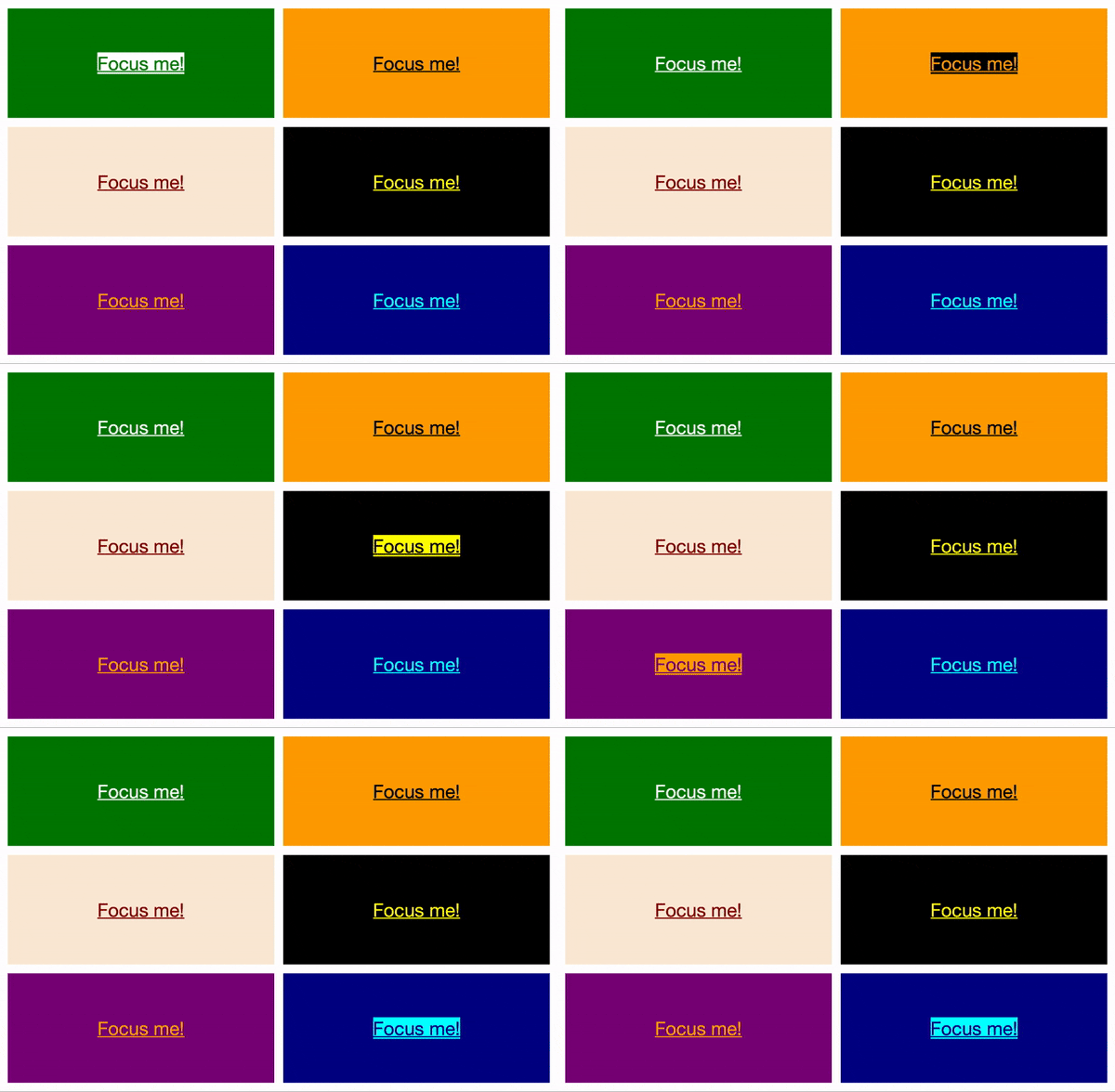
That’s it! See what’s going on? All boxes will get the class name themed-box, which declares that the background color and the color of the text should be set by the custom properties --background and --text respectively. Then, all we need to do is assign the values of those custom properties for each theme we create. Now, without any additional styling for focused links, we get the following:

There’s a CodePen up if you want to play around with this yourself. Happy coding!