A new accessibility tool has joined the party

When it comes to testing accessibility, there is no substitute for the human element. However, a great tool can help identify all the tiny details that our human eyes might miss. In addition to this, performing continuous automated testing is something machines do quite well. Just as continuous integration is the norm in today’s front-end world, so too should accessibility testing be.

The new kid on the block

Enter Squidler; a new accessibility testing tool recently released into the wild. Full disclosure: I happen to know a few of the people behind the product and they’re very talented people, but I also had no idea that they were working on this (which just goes to show how deep I must be in my own work).

Initial impressions

I haven’t had too much time to test the tool out yet, but a few things stood out to me, that I will outline.

Ease of use

Just paste a URL into the input field and let Squidler go to town on your site. It also crawls through your site, so you don’t just get a report on the URL you submitted, but several other pages as well. I had a quick chat with a friend of mine working on the product and he mentioned that the crawling will improve with time and be more aware of pages it crawled in the past, hopefully making it more efficient

Continous testing

Once you’ve entered a website that you want to test, Squidler will keep crawling it periodically. This is a nice feature to me and something that will come in handy once you start fixing issues that the tool will find. Keep fixing issues and deploy them, and let Squidler handle future checks automatically. Nice.

Simple and clear reports

Issues found are clearly explained with suggested fixes, links to documentation about the particular issue as well as screenshots from your site highlighting where the issue resided. You can also step through a timeline that reveals how the tools went over your pages. Love it!

Possible room for improvements

I understand that this tool is in the early stages of its life and so, there’s a few things I noted that could improve it. In no particular order:

  • One URL only? - running tests like these surely doesn’t come cheap in terms of server costs, so I get that there might be limitations. I would however love to see the possibility to test multiple sites. If this feature isn’t currently available, it would be a valuable addition for future updates.

  • Very minimal UI - I should emphasize that this is generally a good thing, but if I dive into one of the reported problems, I would love to have some kind of breadcrumb or other way of getting back to the overview. The back button works just fine, but my confidence is a bit lowered by such patterns. I guess poor website designs over the years with terrible single page apps have ruined me a bit.

I want to be clear that these are very early impressions after only testing the tool for a few hours. As I understand it, they’re still working on improving plenty of things, so take my impressions with a heap of salt.

Closing thoughts (for now)

As I already mentioned, I’ve only tested the tool for a few hours and I haven’t looked over everything the tool has to offer, like the daily and weekly test reports mentioned in their list of features.

The pricing is € 49 per month, which might be steep for a private person, but I don’t think they’re the target audience here. For companies that not only values offering a good experience for their users, but that also cares about the forthcoming European Accessibility Act, this is a low price to pay.
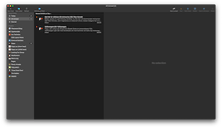
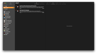
Pointless post of the day – NetNewsWire before and after their Big Sur update

This morning, my app of choice for reading RSS feeds; NetNewsWire, notified me of an update. This was a major version update which included a new app icon and an updated UI for Big Sur. This gave me the opportunity to grab a screenshot to compare. So I did.

Screenshot of NetNewsWire 5.1.3
NetNewsWire 5.1.3
Screenshot of NetNewsWire 6.0
NetNewsWire 6.0

It’s a bit pointless, but also interesting to compare how Big Sur affects the design of apps on the Mac. I’m also thankful I get to keep the text below the icons in the toolbar.

Your website is making me sick — or why you should respect the preferences of your users

There’s an accessibility setting in macOS and iOS that allows users to reduce motion in the interface. On iOS, this removes animations in the OS itself and well made apps should also respect this setting. In CSS there’s a media query for it; (prefers-reduced-motion: reduce), which has for example been supported in Safari since version 10.1. If you are using animations on your website, consider adding this snippet to your stylesheet.

@media screen and (prefers-reduced-motion: reduce) {
  * {
    transition-duration: 0.001ms !important;
    animation-duration: 0.001ms !important;
    animation-iteration-count: 1 !important;
    scroll-behavior: auto !important;
  }
}

But why didn’t I remove the transition and animation durations altogether? Well, retaining the durations but changing them to something that’s imperceptible to the human eye, helps to avoid breaking anything that is tied to CSS-based animations. Make sure test your site, though. I’ve seen stuff break in the weirdest of ways with this styling, so your mileage may vary. Resetting animation-iteration-count disables infinite animations, instead of making the loop crazy fast!

Browser and OS support

Almost all of the major browsers has had support for a good while, the exception being Legacy Edge, which lacks support entirely. Check caniuse.com for more details.

Supporting browsers can read this preference from the OS of your choice. A few examples below.

Windows 10

  1. Settings
  2. Ease of Access
  3. Display
  4. Show animations in Windows.

Windows 7

  1. Control Panel
  2. Ease of Access
  3. Make the computer easier to see
  4. Turn off all unnecessary animations (when possible).

macOS

  1. System Preferences
  2. Accessibility
  3. Display
  4. Reduce motion.

iOS/iPadOS

  1. Settings
  2. General
  3. Accessibility
  4. Reduce Motion.

Android 9+

  1. Settings
  2. Accessibility
  3. Remove animations.

Remember, respect your users. ❤️

Touch ID with sudo

When the first MacBook Pro with a Touch ID sensor was released, I was thoroughly excited. Rightly so. Apps like 1Password was quick to implement support for it. There was one thing that was missing though; authentication with sudo.

XKCD comic
There’s an XKCD for every situation

I’m almost ashamed that after having owned at least two MacBook Pros with Touch ID, I didn’t find out until today about this. So it’s time to write it down. Hat tip to Stanislas and his post “Using Touch ID for sudo authentication on a MacBook” for showing me the way.

Edit (as root) /etc/pam.d/sudo:

# sudo: auth account password session
auth       sufficient     pam_smartcard.so
auth       sufficient     pam_tid.so		# <= Add this line!
auth       required       pam_opendirectory.so
account    required       pam_permit.so
password   required       pam_deny.so
session    required       pam_permit.so

For clarity, the line you want to add (as seen above) is:

auth       sufficient     pam_tid.so

That’s all you need! Oh, and your finger, of course! 😉

Labs are back!

Maybe two or three years ago, I added a section called “Labs” that didn’t actually contain anything. I kept it up for far too long and I never got around to adding the planned content. Well, no more! In a spur of inspiration and motivation, I whipped something up today so that I could finally get some content in. For starters, it’s just some of the more popular CodePens I’ve made over the years. More stuff to come.