This problem really isn’t something new and this specific issue has been repeated on many accessibility oriented blogs over the years. But since I regularly see this mistake being made over and over again, I think it’s time for a revisit. I’m talking about why you shouldn’t style away the :focus pseudo-class.
Pseudo-what?
Pseudo-classes have been around in CSS since the first version, albeit in a more limited manner and without the associated semantic meaning.
From the Mozilla Developer Network article on pseudo-classes:
A CSS pseudo-class is a keyword added to selectors that specifies a special state of the element to be selected. For example
:hoverwill apply a style when the user hovers over the element specified by the selector.Pseudo-classes, together with pseudo-elements, let you apply a style to an element not only in relation to the content of the document tree, but also in relation to external factors like the history of the navigator (
:visited, for example), the status of its content (like:checkedon some form elements), or the position of the mouse (like:hoverwhich lets you know if the mouse is over an element or not).
Clear as a bell, right?
Our focus of the day
The :focus pseudo-class is often forgotten when developers start messing around with styling anchors on a website. However, it is just as important as :hover, :active and :visited. While the :hover pseudo-class matches when the user designates an element with a pointing device, the :focus pseudo-class is applied when an element has received focus, either from the user selecting it with the use of a keyboard or by activating it with the mouse.
In the context of keyboard navigation, the :focus pseudo-class is very important since it helps users who are navigating with a keyboard rather than a pointing device. All browsers worth mentioning have a built-in user agent stylesheet that sets a style for focused elements.
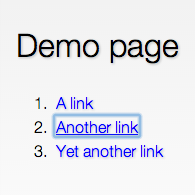
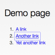
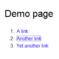
As you can see, the Internet Explorer 8 focus outline looks a little… ugly. Fair enough. But it still provides an important visual cue for users navigating with their keyboards. The problem is that this outline is also present when you’re using a pointing device and it also has a habit of becoming stuck after you’ve clicked a link (especially if you are are using JavaScript to catch the event). This has given rise to the following CSS rule on a number of websites:
a {
    outline: none;
}
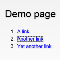
This is, for obvious reasons, horrible. Suddenly, that ugly, ugly outline is gone and your designer is happy. But the accessibility just went out the window. To put it simply, don’t do it! If you must style away the outline, make sure you replace it with something at least equally clear.
The reason I wrote this article is that I still see this transgression on an almost daily basis. I usually navigate with a pointing device (a mouse or a touchpad, for example), but when it comes to forms, I know I’m not alone in tabbing between fields and form controls such as buttons. Say for example that you are about to submit a comment on another blog and you tab out of the text area to press submit, but suddenly, no marker is visible anymore. To make it worse, you might have two buttons after that text area, one for submit and one for clearing the fields. Care to play a little russian roulette with your carefully prepared comment? Didn’t think so.