I have more often than not been faced with the following scenario; a client, a colleague or maybe a project manager will ask the old-as-dirt question:
“What browsers should be supported in this project?”
For way too long I thought of this as a binary issue. You either supported a particular browser, or you didn’t. If you were a really bad apple, you took measures to make sure that the user of a legacy browser you decided shouldn’t be supported got a snarky message as well – “Sorry, your old browser is not supported by us.” – lovely, right?
All this is of course a pretty bad practice and parallels can be drawn to a store owner telling potential customers to get lost just because they can’t climb the stairs to get into the store.
Looking at the browser landscape of today and the future, we can’t keep asking ourselves which browsers to test for and whether we should optimize for legacy browsers, because that just isn’t very practical.

So what should we do?
Brad Frost wrote a great post called “Support Vs Optimization” back in 2011. You should absolutely read the whole thing, but if not, just read this:
“There is a difference between support and optimization” is a line I use regularly at work. For time and budget reasons, we can’t make the best experience ever for every connected device, but we have a responsibility to provide a decent experience to those who wish to interact with our products and services. As we move into the future, it’s going to be harder and harder to account for the plethora of connected devices, so we need to be construct our experiences with more consideration.
A lot of people will argue that supporting legacy browsers means putting in loads of hours adding fixes and hacks to make your web site work in something like, say, Internet Explorer 8 (or even the over-a-decade-old IE 6). But before you dismiss the notion of supporting legacy browsers altogether, consider this quote from the same article:
You don’t have to treat these browsers as equals to iOS and Android and no one is recommending that we have to serve up a crappy WAP site to the best smartphones on the market. It’s just about being more considerate and giving these people who want to interact with your site a functional experience. That requires removing comfortable assumptions about support and accounting for different use cases. There are ways to support lesser platforms while still optimizing for the best of the best.
To get you started, I’d like to give you a few examples of what you can do to achieve this.
Consider progressive enhancement
I will not repeat the many arguments for progressive enhancement, when so many talented individuals have already done this in the past.
If you use a method like “Cutting the mustard” to only serve up JavaScript to modern browsers, you will very likely save yourself a lot of pain.
I’ll refrain from going any deeper into the progressive enhancement part in this post. If you consider yourself to be in the camp that says “But we’re making web apps and this progressive enhancement stuff does not apply to us”, I urge you to have a quick look at the following articles:
- Be progressive – by Jeremy Keith
- Progressive enhancement is still important – by Jake Archibald
- Stumbling on the escalator – by Christian Heilmann
Ok, moving on.
Go mobile first
You might ask yourself what mobile first has to do with legacy browsers. Internet explorer before version 9 does not even understand media queries, right? Well, mobile first in this context could mean that you start with a very basic layout that is defined outside of any dimension based media queries.
@media all {
  /* Put very basic, mobile first layout here */
}
Then you do more complex layouts with something like this:
@media screen and (min-width: 0) {
  /* Juicy, complex and cutting edge CSS goes here */
}
While this might be considered a hack, it’s totally valid CSS. min-width: 0; means all widths from 0 and up, but since IE 8 and older versions doesn’t understand the syntax, they’ll just ignore it. Also, keep in mind that the code snippets above is only the beginning. You of course need to add additional media queries for different breakpoints tailored to your design.
A basic mobile first layout will, provided you’ve kept it simple, work quite well on legacy browsers. Chances are it will look just fine (or fine enough) without you needing to add any quirky hacks to your stylesheet. A great example of how this can look is the web site of Jake Archibald. Visiting his site in something very old (like IE6) and something quite modern (like Safari 8 on OS X) shows something interesting:
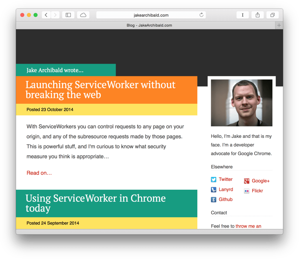
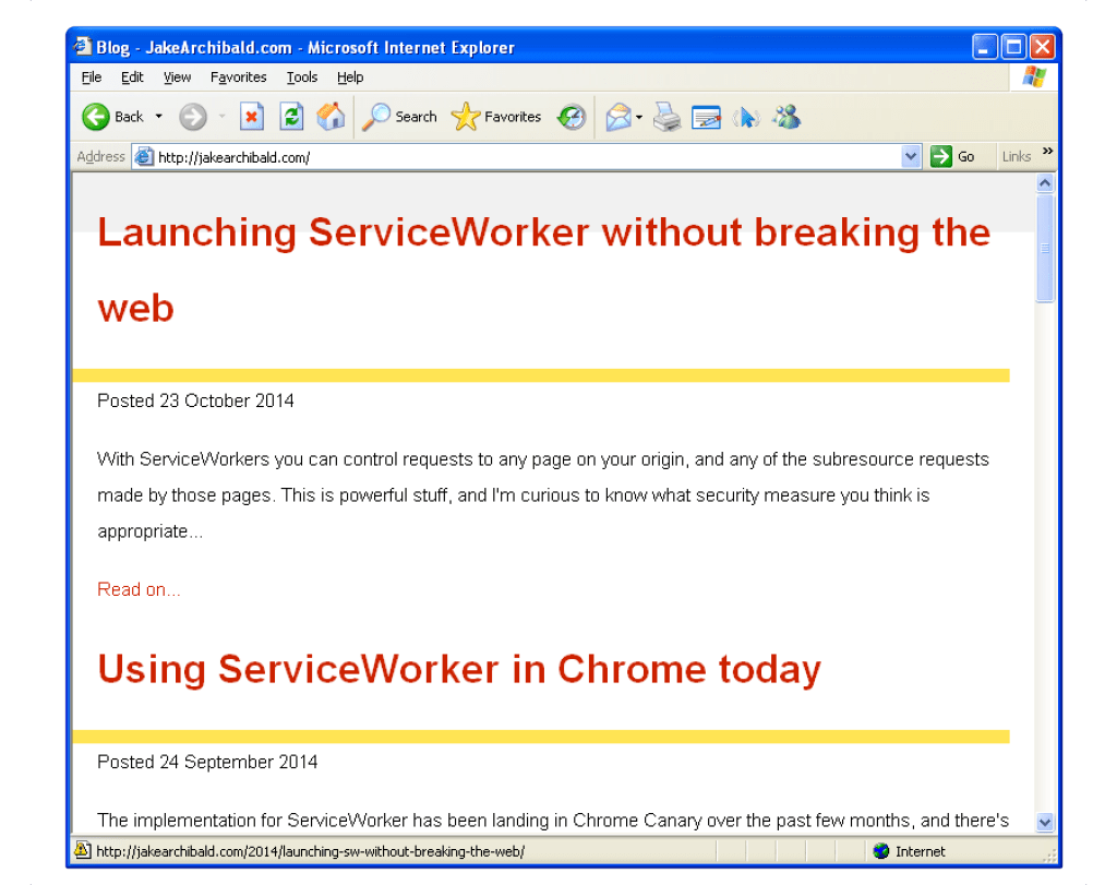
The looks of that site in IE 6 won’t win any design awards (but then again, neither will Windows XP, right?) The most important thing is that it works. The content is there, but all the bells and whistles are absent. My guess is that the designer spent very little time optimizing anything for legacy browsers. However, any unfortunate soul using IE 6 on Windows XP will still be able to get the core experience; the content. This is what matters the most.
This is only the beginning
This post will hopefully give you just a little bit of inspiration and maybe help you realize that supporting legacy browsers does not have to result in a lot of extra work. In return, you will reach a wider audience and most likely be happier for it.